
The ThresholdMark journal · Vastu & tradition
Vastu Tips for House Nameplates: Placement, Direction, Colour & Design
Explore traditional nameplate preferences alongside practical advice on placement, colour, lighting and clear lettering for Indian homes.
In this guide
For many Indian families, choosing a nameplate is part of making a new house feel like home. The wording may honour a family, the house name may carry a personal meaning, and the position or colours may reflect Vastu preferences passed down through the household.
This guide treats those preferences as cultural and traditional choices. Vastu recommendations differ between practitioners and publications; they are not scientifically established guarantees of prosperity, health or good fortune. You can respect a tradition while also prioritising a secure mounting, readable text and the practical limits of your entrance.
The starting point
Start with a visible, well-kept nameplate near the entrance. If you follow Vastu, choose a consistent interpretation that matters to your family rather than combining conflicting online rules.
Placement: make the home easy to identify
Place the nameplate where a visitor naturally looks when approaching the main entrance. For an apartment, that usually means on or beside the door; for a house behind a compound wall, an address marker at the gate may be useful as well. A decorative plate deep inside the porch cannot help someone find the correct gate.
Keep the sightline clear of plants, an opening door and hanging decorations. Use a paper template to test the proposed position from the actual approach. Consider the doorbell, intercom and existing house number together so each element has space instead of competing for one small patch of wall.
Eye-level placement is a useful practical starting point, not an exact universal Vastu measurement. The entrance, reading distance and people using it vary. Choose a position that is comfortable to see and safe to maintain, then confirm the fixing method for that surface.
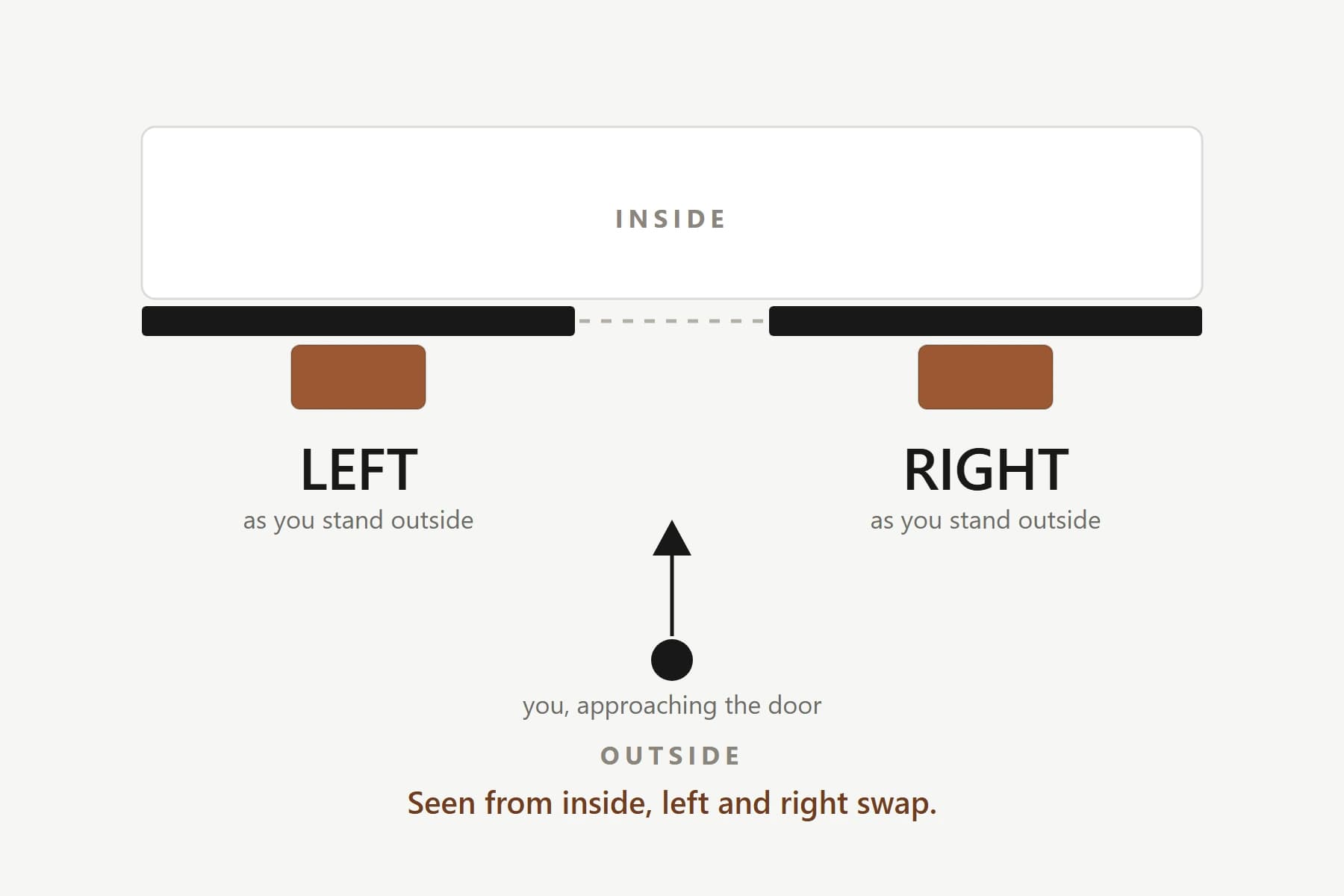
Left or right of the door? Why advice differs
Published advice is not consistent. JK Cement's nameplate guide recommends the right side, while iCreations describes a left-side preference viewed from outside and acknowledges alternative recommendations. This is a useful reminder that a single placement diagram should not be presented as a rule followed by everyone.
If a particular tradition is important to your household, agree on whose guidance you are following before drilling. Be precise about the viewpoint: left while standing outside facing the door is different from left while standing inside looking out. A photograph marked with the intended position can prevent confusion with the installer.
Where the preferred side contains an electrical panel, insufficient wall space or an obstruction, discuss an alternative. There is no reason to treat a practical constraint as evidence that the home is unlucky. The nameplate should work with the entrance you have.
Further context: JK Cement: published nameplate placement preferences · iCreations: an alternative placement interpretation
Direction: define what you are measuring
A discussion about direction can refer to the main door, the gate or the face of the plate. These are not always aligned, especially in apartments with turning corridors or houses with a side entrance. Before selecting colours from any direction-based guide, clarify which entrance and which facing it means.
A phone compass can help you make an initial observation, but nearby metalwork and electrical equipment can affect its reading. If your decision depends on a precise orientation, confirm it using a suitable site assessment. Avoid changing a functional doorway or making structural alterations solely to accommodate a nameplate.
For an apartment, distinguish the building entrance from your own flat entrance. State which one you mean when seeking guidance or discussing the installation.
Colour: traditional suggestions, practical contrast
Some contemporary Vastu guides associate colours with the direction of the main entrance. The palette below summarises suggestions in the cited JK Cement guide; it is one published interpretation, not an agreed standard or a claim that a colour changes your fortunes.
Use such preferences as a starting point for the palette, then check the lettering against the background. A colour your family likes can appear in a narrow border or a small accent instead of covering the entire plate. Readability matters in daylight and under the actual porch or corridor light.
| Entrance facing | Published colour suggestions | A practical design approach |
|---|---|---|
| North | Green, blue or earthy tones | Use a restrained accent and keep the name clearly contrasted |
| East | Wood tones, brown or beige | Check that warm lettering does not disappear on a warm background |
| South | Deep red, maroon or terracotta | Balance a strong colour with simple, readable lettering |
| West | White, grey or metallic tones | Check pale and reflective finishes under the entrance light |
Further context: JK Cement: colour suggestions by entrance direction
Material and shape: keep belief and specification separate
Families may prefer wood for its natural character, metal for a traditional appearance or a simple rectangular outline. Those preferences can guide the design without replacing the practical questions about material quality, exposure and care. A wood-coloured surface, for example, does not necessarily mean a plate is made from solid timber.
For an exposed entrance, choose a construction suitable for the location. For a covered apartment door, proportion and contrast may be the more immediate concerns. If a requested traditional detail is not available in a standard layout, confirm whether it can be produced before assuming it will appear in the finished plate.
A modest border and enough open space around the words are often easier to coordinate with an existing door than several motifs. Examine the complete composition with your own names, because sample lettering may be much shorter than the wording your family wants.
Names, house numbers and meaningful symbols
Choose wording that represents the people who live in the home. A surname, two individual names or a meaningful house name can all form the main line. Include a clear house or flat number when it helps visitors identify the address; keep supplementary words secondary to the essential information.
A religious or cultural symbol can be included if the household wants it and the selected design supports it. Give it enough space to be recognisable without making the names too small. Agree on the exact artwork and orientation in the final proof rather than relying on a general description.
For a regional-language nameplate, ask a fluent reader to check the spelling and letter forms. A correctly rendered digital preview and a legible manufacturing proof are more useful than choosing a decorative font solely because it looks traditional.
Lighting and care support the design
A tidy, visible entrance is compatible with many traditional preferences and also helps guests. Keep the plate clear of dust and foliage, and use the maker's cleaning instructions for its finish. If a fixing becomes loose or the plate is damaged, repair it for safety and appearance rather than interpreting the damage as an omen.
If the entrance is dark, consider whether the existing light can illuminate the sign before choosing an LED plate. For an illuminated design, plan power, suitable equipment and service access with the installation team. Decorative lighting should not create glare that makes the name harder to read.
- Agree on wording and the traditional preferences your family wants to follow.
- Test visibility and the proposed position with a paper template.
- Confirm building permissions and the mounting arrangement.
- Check the complete proof, including symbols and regional scripts.
Common questions
Must a nameplate always be on the right side?
No single placement recommendation is shared by all published Vastu guides. Some favour the right and others the left. Clarify the viewpoint and the interpretation your family follows, then check the physical suitability of the position.
Is a black nameplate bad luck?
There is no scientific basis for concluding that a black nameplate causes bad luck. Traditional colour preferences vary. Choose a palette that fits your household's preferences and keeps the text readable.
Do I need to replace an existing plate that does not match a colour chart?
A colour chart is a traditional preference, not proof that your current plate is harmful. Consider replacing a plate for readability, condition or a design you prefer, rather than out of fear.
Can I follow Vastu in an apartment with limited wall space?
You can choose meaningful wording, colours and a clear layout within the available space. Respect building rules and secure mounting requirements, and discuss alternatives if your preferred location is obstructed.
From inspiration to your entrance
Make the entrance feel like your home
Explore nameplate layouts and choose wording, colours and details that suit your family's preferences.
Explore the catalogueContinue reading
All guides →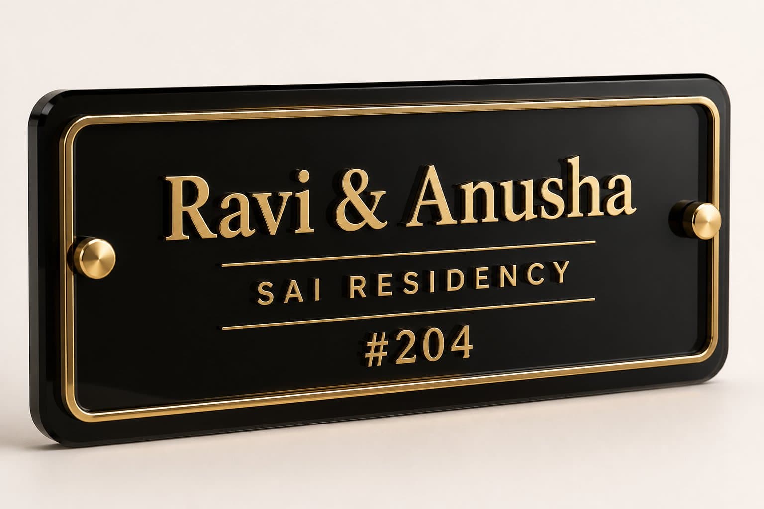
Design inspiration
10 modern nameplate ideas for a considered entrance
From black and gold acrylic to warm wood and bilingual lettering, find a nameplate style that belongs with your door, lighting and architecture.
Material comparison
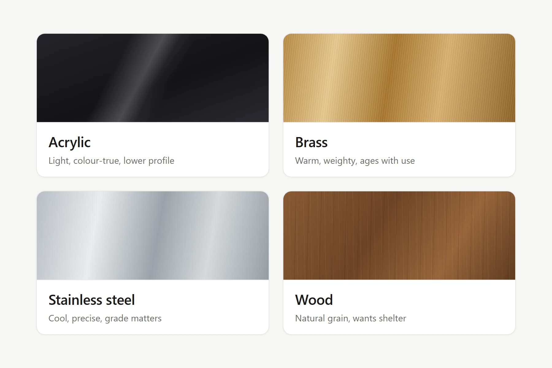
Acrylic, brass, steel or wood? Choose with confidence
Compare four nameplate materials by appearance, care, exposure and cost, with practical questions to ask before you order.