
The ThresholdMark journal · Design inspiration
10 Modern House Nameplate Design Ideas for a Stylish Entrance
From black and gold acrylic to warm wood and bilingual lettering, find a nameplate style that belongs with your door, lighting and architecture.
In this guide
A stylish entrance does not need a large sign. It needs a nameplate that feels at home beside the door. Colour, lettering, proportion and lighting work together: when one element becomes too loud, even an expensive plate can look out of place.
Start with a photograph of your entrance taken from where a visitor would first read the name. Notice the door finish, wall colour, handle and light fitting. Choose one or two of those details to echo in the plate. These ten directions give you a useful starting point, whether you are finishing an apartment, a villa or a covered porch.
The starting point
Choose the style with your entrance in view, then test it with your actual name. Readable lettering and comfortable space around it matter more than extra decoration.
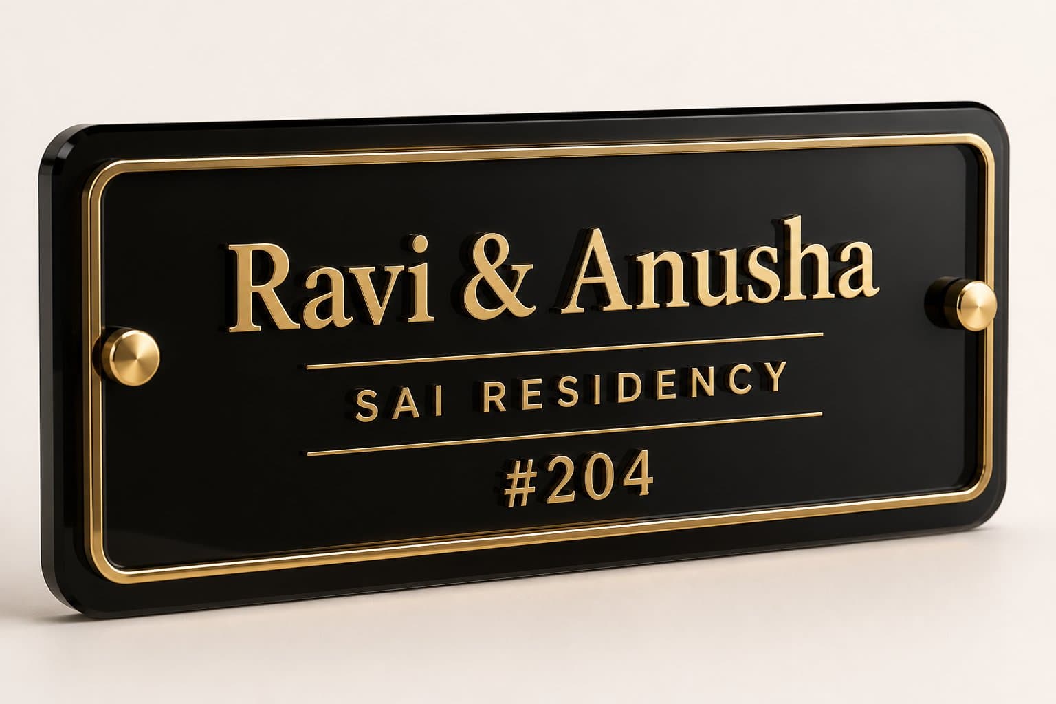
01. Black acrylic with gold lettering
A black background gives gold lettering a strong visual presence. It works especially well when the entrance already has a warm metal handle, a dark door or a restrained stone surround. A narrow border can frame the words without making the plate feel heavy.
Keep the family name or house name as the main line and give the house number its own smaller space. If your name is long, reduce decorative elements before reducing the lettering. Gloss can catch reflections, so consider where the corridor or porch light will sit relative to the plate.
- Best visual fit: dark doors, warm hardware and uncluttered walls.
- Layout cue: one dominant name, one supporting line, a clearly separated number.
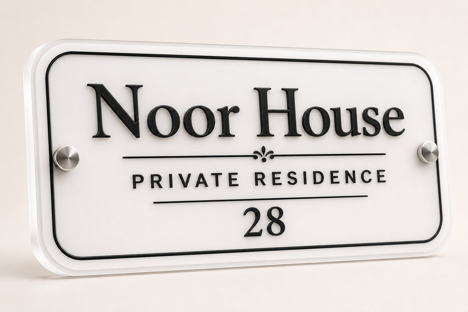
02. Minimal white acrylic
White acrylic creates a lighter entrance, particularly against grey, timber or coloured doors. Dark lettering offers a straightforward starting point for contrast. This is a useful direction for smaller apartment entrances where a dark, oversized plate could dominate the wall.
Choose a simple typeface and avoid filling every available line. On a pale wall, a subtle border or a visible edge helps define the plate. Check the design against the actual background: a white nameplate photographed on a dark backdrop can look quite different once installed on an off-white wall.
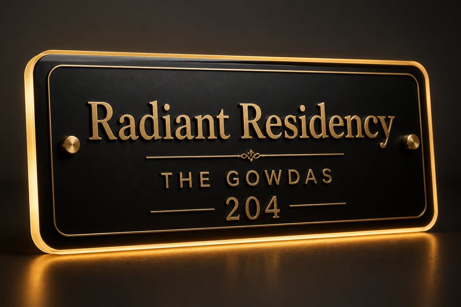
03. Warm backlit LED
Backlighting gives a nameplate a second character after sunset. A restrained halo can be an attractive choice for a villa porch or an entrance set back from the street. The plate still needs to read well when the light is switched off; illumination should support a good daytime layout.
Plan the power route and access to the driver before choosing the mounting position. Ask which parts of the complete assembly are suitable for the intended exposure, and who will handle the electrical connection. Avoid placing the brightest glow directly behind thin lettering that becomes difficult to distinguish.
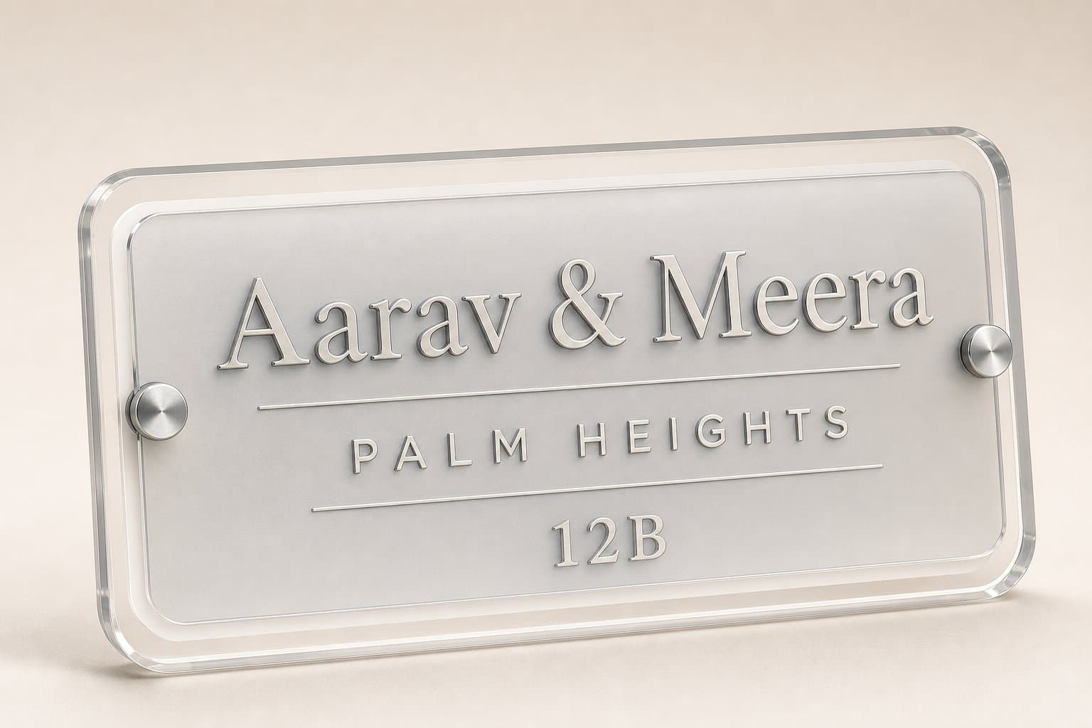
04. Frosted clear acrylic
Clear and frosted layers create depth without introducing a large block of colour. This suits a calm, contemporary interior or a sheltered entrance with a wall finish worth keeping visible. Spacers and fixings become part of the composition, so their position deserves attention.
Check contrast against your wall rather than only against the product photograph. Pale lettering can disappear against a pale surface, and a textured wall may compete with a transparent plate. A frosted backing can soften the view through the sign while retaining a light appearance.
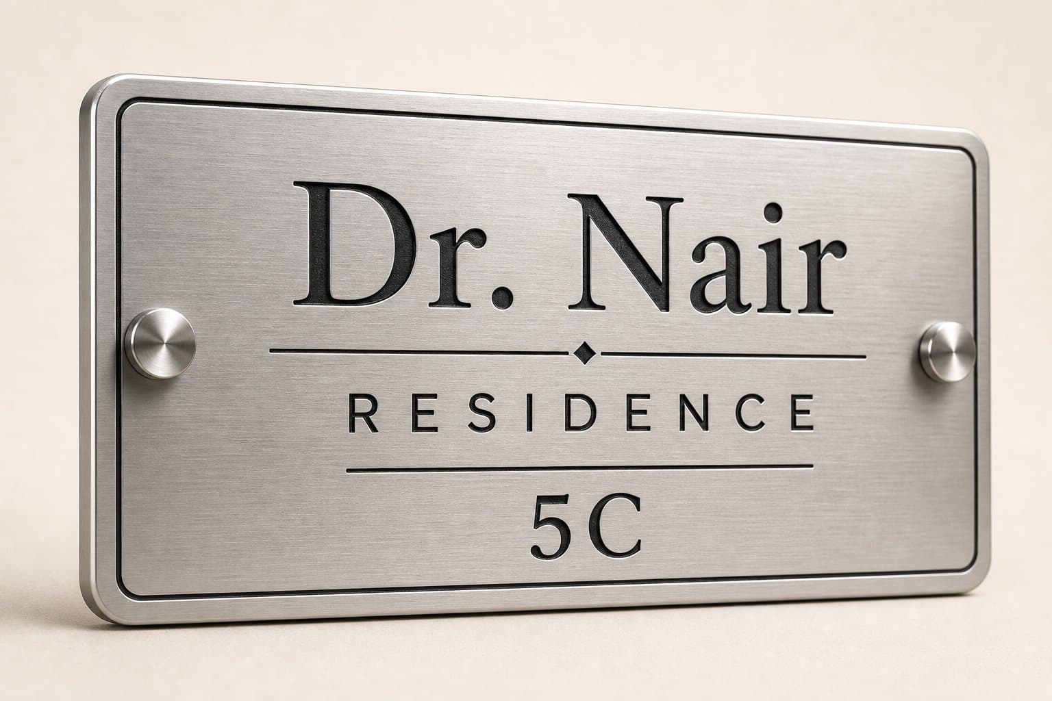
05. Brushed stainless steel
A brushed metal finish pairs naturally with concrete, grey stone and silver door hardware. Its quieter reflection can feel more architectural than a mirror finish. Bold, uncomplicated lettering is a useful partner because the material already brings texture to the design.
For an exposed or coastal position, confirm the actual stainless-steel grade and the maintenance expected for that location. The word stainless alone does not describe every alloy or finish. Keep the house number distinct from the surname so visitors can identify the address at a glance.
06. Classic brass
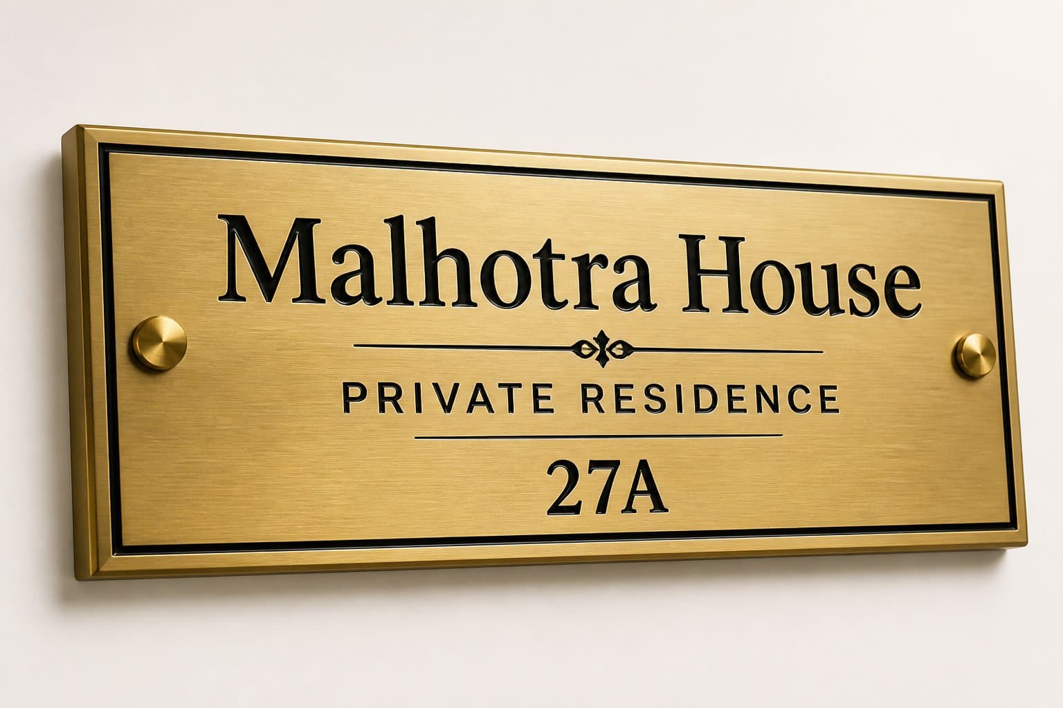
Brass brings warmth to a traditional doorway and can also provide a deliberate contrast against a minimal facade. A simple rectangle with well-spaced lettering often gives the material more room to speak than elaborate ornamentation.
Ask whether the product is solid brass, brass sheet, a coating or a brass-coloured finish on another base. These descriptions affect the care required. Brass can change appearance through tarnish and patina; if you want a consistently bright finish, discuss the protective finish and its upkeep before ordering.
Further context: Copper Development Association: brass finishes and patina
07. Natural wood with restrained lettering
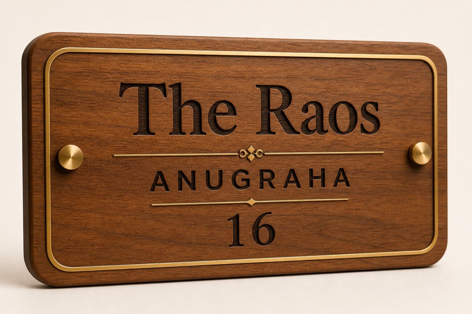
Wood introduces grain and variation, making it a welcoming partner for plants, textured walls and covered porches. Engraved letters offer one expression; contrasting raised letters create another. Let the grain remain visible instead of covering the whole surface with text.
Identify the species or board construction and ask how all faces and edges are finished. For an outdoor position, suitability depends on the complete product and its maintenance. If your entrance is directly exposed to rain, discuss that exposure explicitly instead of assuming that any product described as wooden will suit it.
08. Raised lettering on a contrasting backboard
Layering creates small shadows around the letters and makes the sign feel more dimensional. A dark backboard with lighter lettering is one option; a timber base with metal-look letters is another. Keep the frame and decorative motifs quiet so the depth remains the feature.
Ask how the letters are attached and what cleaning method is appropriate around their edges. View a sample from an angle as well as straight on. Thick, closely spaced letters can become visually crowded when the plate is seen from the side of a narrow corridor.
09. A compact apartment composition
A small nameplate can feel deliberate when its hierarchy is clear. Put the most useful information first: typically the flat number and a name. Avoid adding the full postal address when the building and corridor already supply that context.
Measure the usable space beside the doorbell, frame and switchboard. Cut a paper rectangle to the proposed size and tape it temporarily in place. Step back to the lift lobby or corridor approach. This simple check shows whether the plate is comfortably readable and whether its proportions suit the entrance.
10. English and an Indian language
A bilingual nameplate can express identity while helping different visitors recognise the home. Give each script sufficient space rather than forcing both into a single narrow line. A shared house number can anchor the layout without repeating every detail.
Use a layout intended for the required script and have a fluent reader check the final proof. Transliteration, vowel signs and joined characters deserve the same care as the English spelling. Confirm font and production support for your chosen language before approving a design.

Bring the idea back to your entrance
Narrow the options to two styles and compare them with your entrance photograph. Use the same wording in both previews so you are judging the design rather than the sample name. Check the longest line, the house number and the contrast under the lighting you actually have.
Before ordering, confirm the material, dimensions, mounting method and exposure requirements. Catalogue images are useful style references; your final decision should be based on your own text and the agreed production specification.
- Photograph and measure the intended position.
- Choose one main name and a clear supporting hierarchy.
- Check the design at a realistic reading distance.
- Approve the spelling and layout before production.
Common questions
Which style works best for a small apartment entrance?
Start with a compact, high-contrast layout and minimal ornamentation. Test the proposed dimensions with a paper template beside your door before deciding between a light or dark finish.
Do modern nameplates need LED lighting?
No. A well-proportioned plate with readable lettering can work beautifully without illumination. Consider LED lighting when the entrance needs visibility after dark and a suitable power connection is available.
Can I combine a house name, surname and flat number?
Yes, if the layout has room. Give one line visual priority and keep the other information smaller but readable. For a long name, consider a larger layout or fewer supporting words.
From inspiration to your entrance
See a style with your own name
Choose a catalogue design, enter your details and review the personalized preview.
Explore nameplate designsContinue reading
All guides →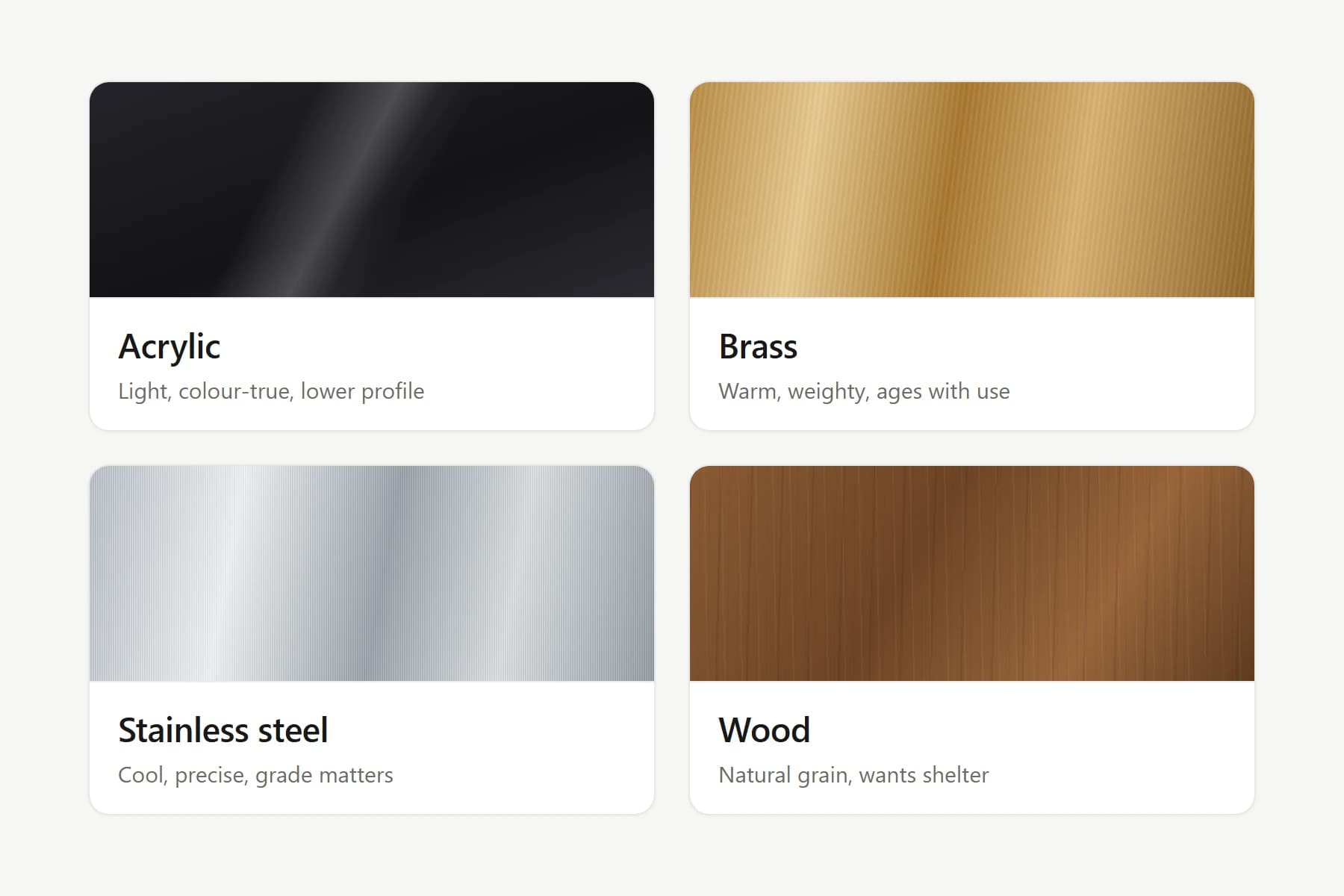
Material comparison
Acrylic, brass, steel or wood? Choose with confidence
Compare four nameplate materials by appearance, care, exposure and cost, with practical questions to ask before you order.
Vastu & tradition
A thoughtful approach to Vastu and your nameplate
Explore traditional nameplate preferences alongside practical advice on placement, colour, lighting and clear lettering for Indian homes.